
I had been very skeptical about how AI tools can actually replace software engineers but today my mind was blown. This post describes how I used Windsurf to build a full stack application that fetches data from US Treasury, displays yield curve chart for an historical date, visualizes yield curve shape changes with animation, and displays a full time series chart for a specific maturity when a specific data point is clicked. I also asked the tool to improve the application security posture, adding a rate limiting function, and automatically refreshes data every hour from the US Treasury. (Note: the demo is no longer available.)
All that was done within a couple of hours. I refrained from coding myself and I was successful in doing that about 95% of the time. That means the tool is pretty good at doing most of the work for me without me having to take over and complete the task.
The inspiration came from numerous hype recently about how someone can build software without any programming skills. I did a quick google search, and it suggested that the most popular tools include Windsurf, Cursor, etc. After viewing an inspirational tutorial by Matthew Berman, I decided to give Windsurf a try.
The application idea is just a simple visualization tool for the US Treasury yield curve. The daily time series data is freely available from US Treasury website in a tabular format. The shape of the yield curve is an important information for investors. I won’t go into details here in this post, but people who are interested in the economy and how the yield curve reflects investor expectation can study more about that. In this post, I will share the entire journey and experience for asking AI to do the work.
Building the app
First, I describe the intent to build the app and where to download the data from the US Treasury website. The initial result was quite phenomenal and I got pretty far with this version 1 quickly in just about 10 minutes. BTW, I used the GPT-4.1 model which was free for a limited time.
Challenge: axis scaling issue
Prompt: The x-axis is not scaled correctly. For example, the space between 10 Yr and 20 Yr should be 10 * 12 = 120 months, and that should be 120 / 6 = 20 wider than the space between 6 Mo and 1 Yr. Can you fix that? Make sure that the axis labels are correctly displayed and correspond to the data points.
Result: AI tried to change the code several ways, and it was able scale the data points properly but the x-axis labels are missing or wrong. Then, I went through several loops of conversations and tried multiple models, and none of them worked properly. However, there’s an interesting workaround… read on.
Learning #1: Also pay attention to intermediate results and not just the final version.
An interesting outcome was that these AI models actually perform a single task by making multiple changes to the source code. Since this is a react web app, I could see the chart changes immediately while the code editing was happening. The o4-mini-medium worked mid-stream, and I stopped it immediately and accepted the code just in time before it messed up itself.
Learning #2: Help the AI by providing some potential solution that you might have found from Google.
AI struggled to find the right solution and so I did a Google search. Then, I provided a prompt like this:
It seems that chart.js has a time cartesian axis function. Would that work? Can you try that? https://www.chartjs.org/docs/latest/axes/cartesian/time.html”
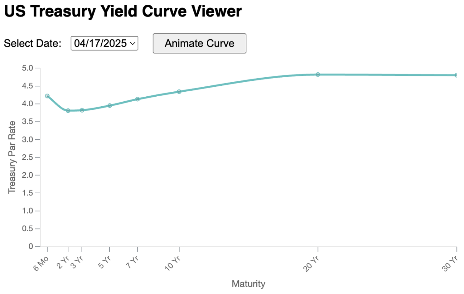
The end result now looks like this.
Challenge: tick mark issue
The grid lines were pretty annoying and so I wanted to remove them.
Prompt: Remove the grid lines.
Result: The grid lines were removed for sure but the tick marks were gone as well :-(
I went through multiple loops of conversations and different models again, and none of them were able to put back the tick marks. I checked the code and they were actually quite reasonable so I did a Google search and found this stack overflow post and found a tickColor hack. So, I took over and fixed this problem manually.
Learning #3: Don’t spend too much time if the AI can’t do the work
I literally spent 30 minutes just going back and forth with different models and different ways of prompting. While it’s a good learning experience for me (for improving my prompting skills), it’s probably best to switch back to other alternatives once you realize the AI is unable to complete the task.
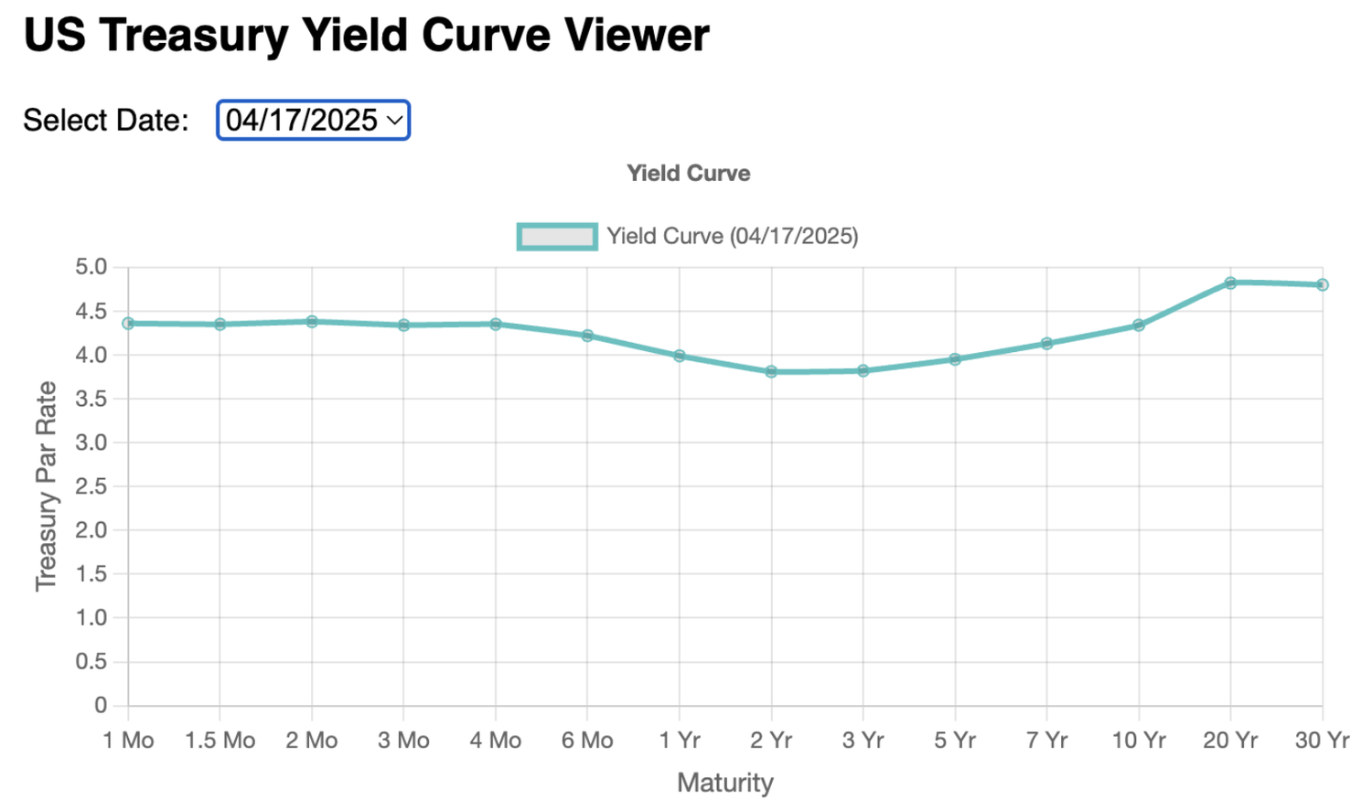
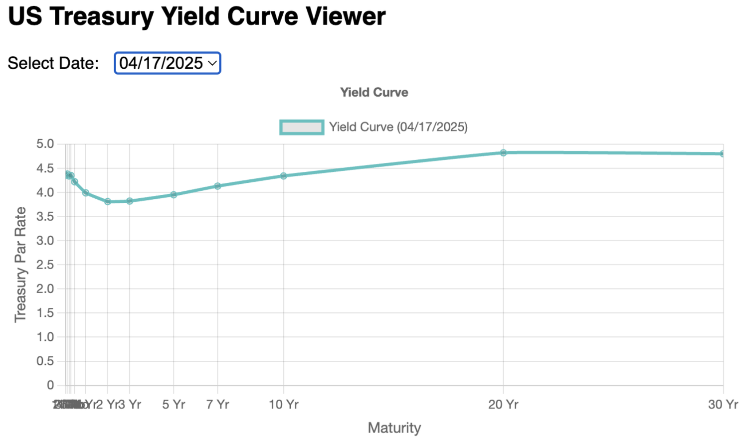
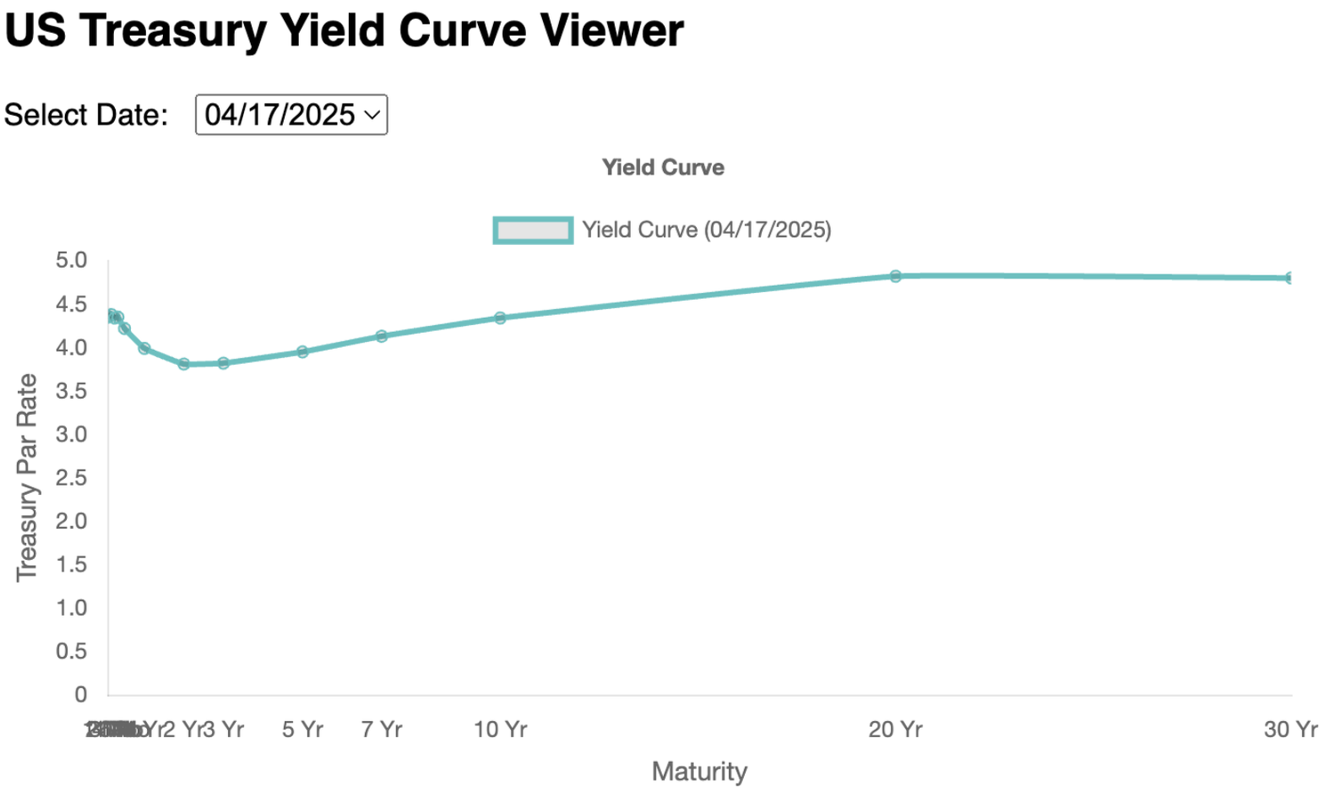
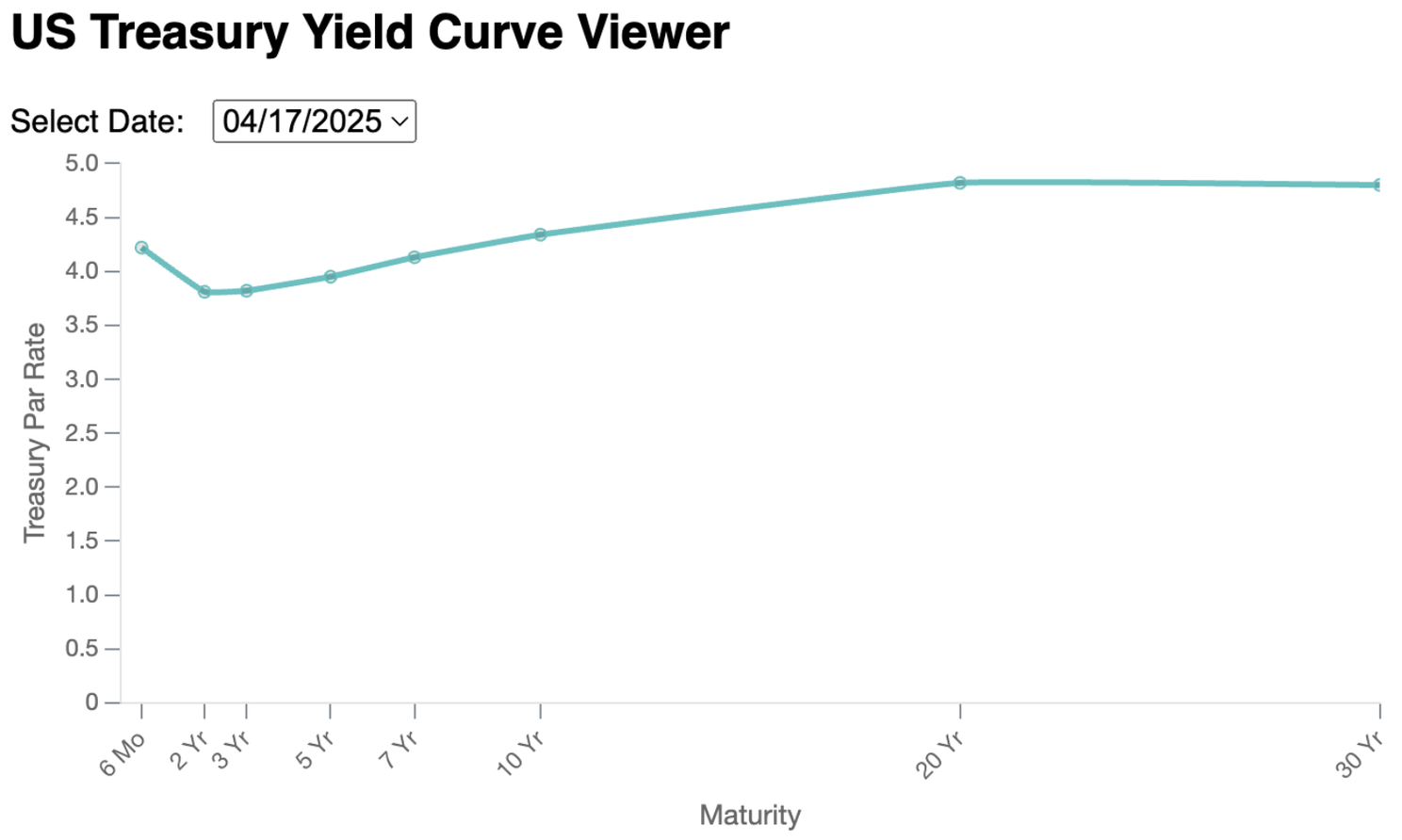
Prompt: x-labels are too crowded. Can you remove the first few maturities (1 Mo, 1.5 Mo, 2 Mo, 3 Mo, and 4 Mo).
Result: Somehow it still displayed “Month” somewhere. It turned out that the US Treasury CSV file has a different header convention for the 1.5 Month column (welcome to the world of dirty data; who would have thought of that). So I just followed up with a new prompt: Remove “1.5 Month” as well. I also asked AI to rotate the labels, remove the unnecessary title and legend, and make it a b-spline curve.
Animation
At this point, I had gotten more ambitious to build something more complex.
Prompt: Add a button to animate the curve. When I click on the button, it should start with the minimum date, display the chart for that date, wait 0.5 seconds, then change to the next day, and repeat until it displays the chart for the maximum date. The animation stops at that point.
Result: It added a button just like how I described and the animation actually worked!
However, there were a few problems and so I followed up with a few other prompts.
Prompt: It’s animating from max date to min date rather than min date to max date. Can you fix that.
Prompt: The animation does not look good. For every date, it has its own “sub-animation” that displays the chart with all data points having y value as zero. So, it looks like the curve moves up from the bottom, and it repeats for every frame in the animation. Can you fix that.
Prompt: The animation doesn’t look good as the y-axis scale is shifting in every frame. I think you can fix that by using a standard min/max values for the y-axis. Can you fix that to min=0 and max=8.0
Results: All of these were completed successfully.
Get more data
Prompt: I want to extend the number of dates as it only has current month data currently. The following URL that fetches from treasury specifies a single month only. Change the backend such that it fetches all months starting from Jan 2025. Download the data in parallel to minimize latency.
Result: Perfect code, except that I noticed the downloads happened asynchronously and the server starts listening before the the data is ready.
➜  backend npm start
> yield-curve-backend@1.0.0 start
> node index.js
Starting initial Treasury data download...
Fetching CSVs for months: 202501, 202502, 202503, 202504
Backend listening on port 4000
All CSVs parsed. Total records: 74
Initial Treasury data download complete.
Prompt: Can you make it such that the backend does not listen to the port until it’s finished fetching all files from treasury.
Result: Fixed and works perfectly.
Then, I noticed that the dates are kinda messed in different orders because the files were downloaded separate and probably just got stitched together.
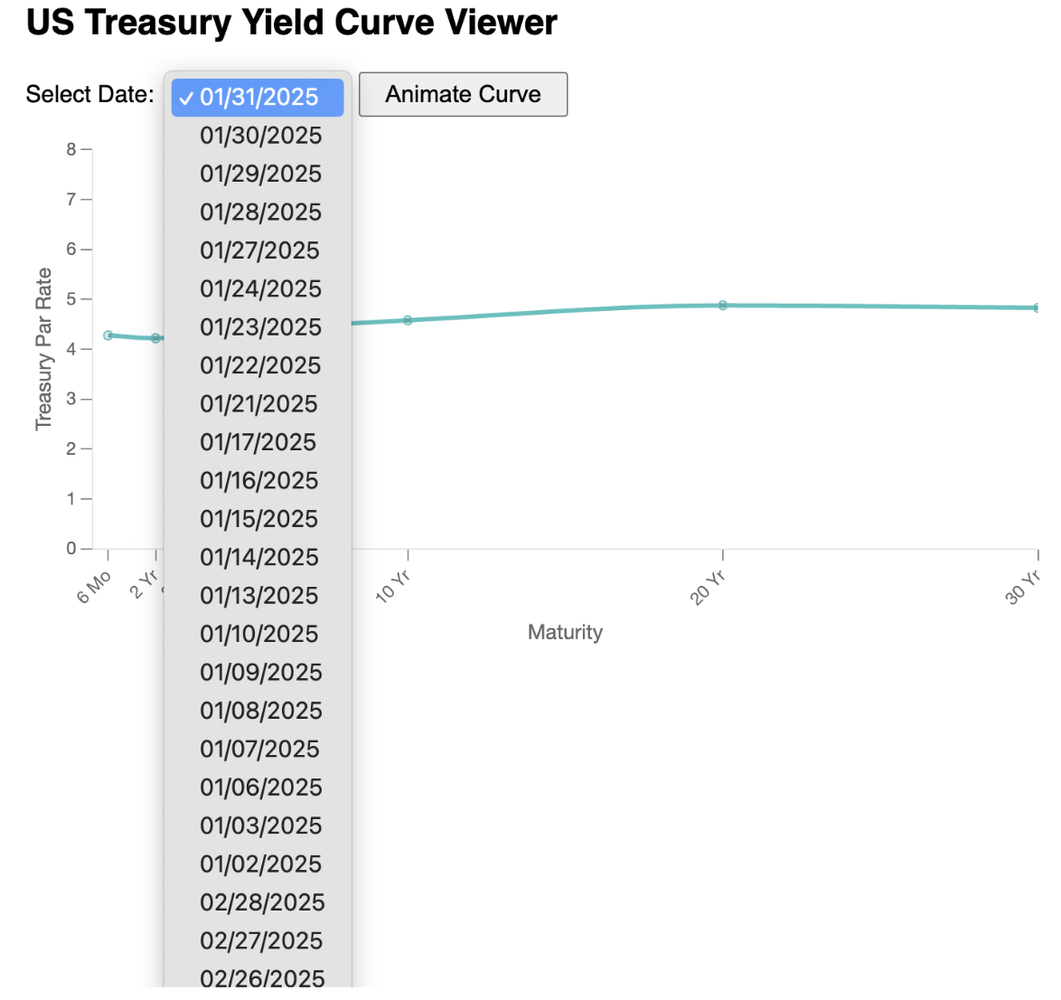
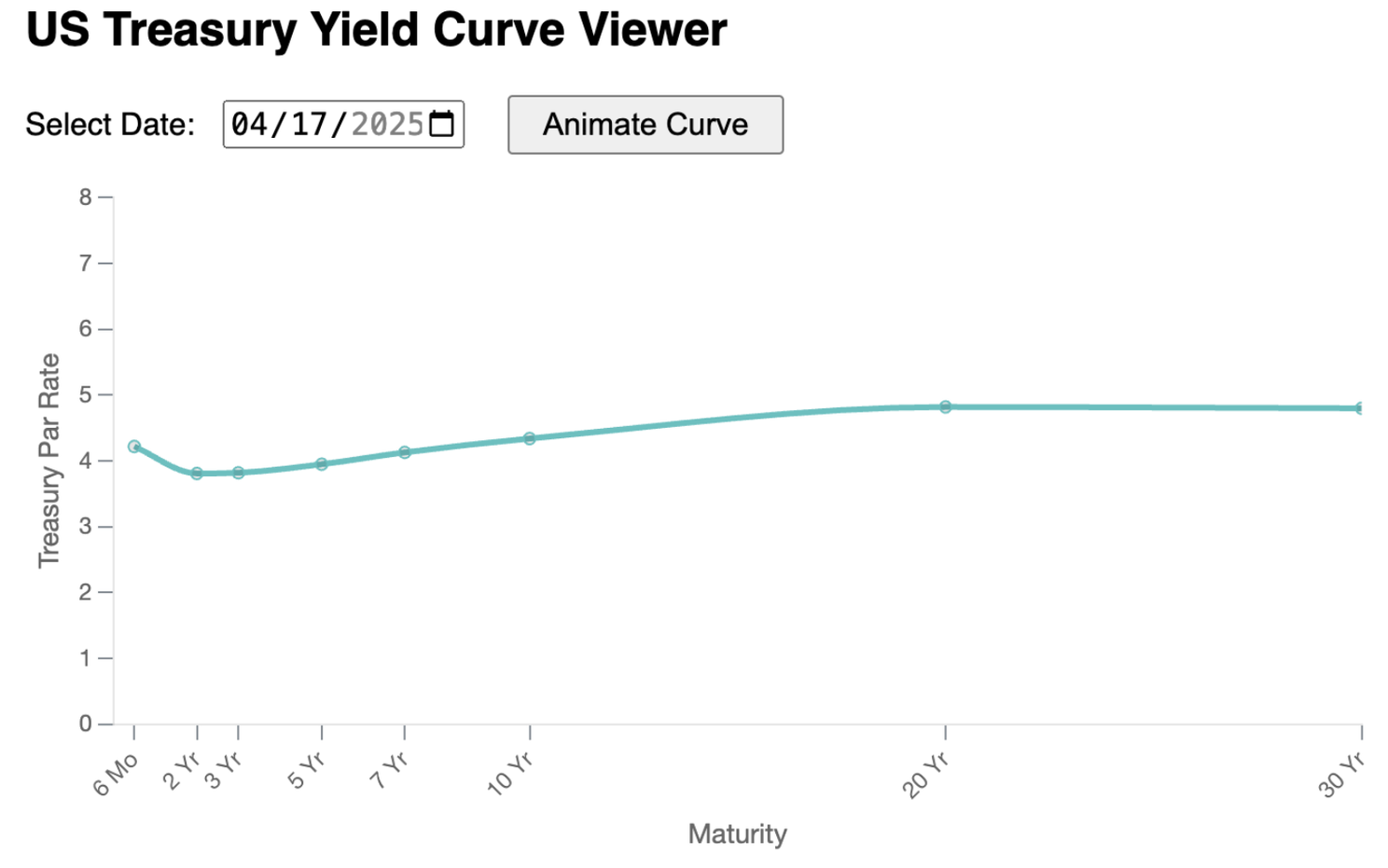
Prompt: Instead of a dropdown for the dates. Can you turn that into a date picker widget? Initialize with the most recent date. If I choose a date that is outside the range of available dates, display a popup with an error message that says “The earliest date is {yyyy-mm-dd}” with the earliest available date.
Prompt: The date picker is there but it is not populated with the most recent date. Can you fix that?
Prompt: Error in javascript console:
react-dom.development.js:1661 The specified value "04/17/2025" does not conform to the required format, "yyyy-MM-dd".
It took me a few prompts to get this fixed. Here’s the final product.
Deployment
I wanted to deploy the code to my EC2 server. AI made a change such that the backend url can be productionalized with an environment variables:
const API_BASE = process.env.REACT_APP_API_BASE || 'http://localhost:4000/api';
I didn’t really like the environment variable name and so I renamed it manually:
const API_BASE = process.env.YIELD_CURVE_APP_API_BASE || 'http://localhost:4000/api';
But, it didn’t work.
Prompt: The code does not seem to work with process.env.YIELD_CURVE_APP_API_BASE, even though I have done this before “npm start”: export YIELD_CURVE_APP_API_BASE=http://ahsmart.com:4000/api
Response: The reason process.env.YIELD_CURVE_APP_API_BASE does not work in your React app is because Create React App only exposes environment variables prefixed with REACT_APP_ to your frontend code.
Learning #4: AI sometimes knows better than you.
This should not be surprising. AI definitely already knows more than me for a lot of things with this full stack app (I’m more like a backend engineer). However, who would have thought the naming convention of environment variables makes any difference?
Security
Prompt: Is there any security vulnerability concern to deploy the app as of the current state?
Note that I used the chat function (as opposed to “write” function) this time, so the agent gave me a pretty long list of things. It boils down to the following suggestions.
- Cors: restrict backend access only when it’s redirected from my frontend domain
- Use helmet for rate limiting
I asked AI to make the changes and followed with more prompts below.
Prompt: What happens when the rate limit is breached. Can I get a notification somehow? Actually, I just want to log something to the console when the rate limit is breached. However, do not write the error to the console more than 1 message every minute.
Prompt: How to reduce load on the backend? Can all API requests be cached with 5 minute TTL?
Prompt: Can I use a browser cache instead?
Prompt: Change the animation such that it only start from 60 days ago
Results: The above changes were all completed smoothly.
Interactivity
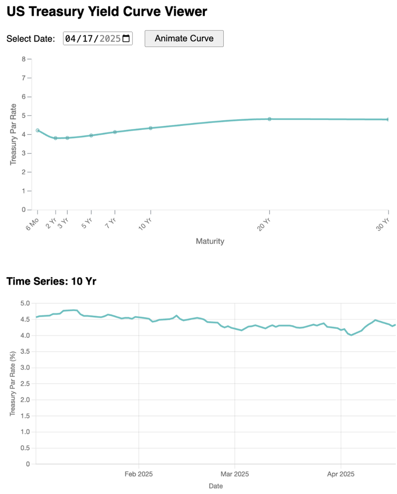
Just displaying a chart with some animation is honestly still pretty boring. As an analyst, I might want to actually drill down and understand how treasury yield changes over time for a single maturity.
Prompt: I want to display a new chart at the bottom when a data point is clicked in the top chart. The new chart should display the full time series data for the maturity being clicked on.
Result: None of the models worked well with this task. They got into troubles like
- Clicking on a data point does not actually do anything
- Generated code does not compile
- Clicking on a data point produces JavaScript error
I don’t remember all the steps but after an hour of trial and error, I finally made it work with the Deepseek V3 model. Here, I don’t regret spending so much time with the agent since I would probably take about the same time if I have to code it myself with some learning curve. However, I was probably also a little fortunate for the AI to complete the task.
Final thoughts
Mark Zuckerberg recently spoke about the possibility of an AI that can work like a mid-level software engineer. I was like, “really? good luck. with that” Now, I have no doubt that it will happen. Vibe Coding sounds like a hyped term, and maybe it is, but the potential for these AI agents taking over large chunks of coding work is very real.
So what does that mean for software engineers today and tomorrow? Is coding skill still useful? IMO, software engineers and product managers have different roles and have different specialties today. It’s likely that these two roles converge to some extent:
Software engineers can adopt more of a product mindset and shift some time to developing ideas and trying different solutions. They also have the knowledge to ask the right questions and make sure that the AI is building software the right way, solving specific problems like security, scalability, performance, etc. They become more of generalists than specialists.
Product managers adopt more AI tools and develop quick prototypes and potentially launch some products and go-to-market quickly. They are no longer bound by waiting for engineers to build the product as they can just iterate with AI more quickly along the way.
AI is a great tool that can improve the productivity of software engineers and product managers greatly. The most exciting part is that such tools already exist today and available cheaply. If you are a young person early in your engineering career, make sure that you jump on the boat and learn how to utilize these tools. If you are an experienced engineer with decades of programming experience, you should keep an open mindset about what these tools can achieve and adopt them as much as you can. I believe the future is very bright for everyone.